

Lights 💡, camera 🎥, dashboard design 🎭!
Are your dashboards failing to engage your audience?
It’s time to TAKE CONTROL 🕹️
Take control of the story and win your audience’s hearts ❤️️ and minds 🧠 with cinematic secrets for effective dashboards.
As Proximo famously advised Maximus in Gladiator:

As a dashboard designer, you are a data salesman. 💼💰💬
Your audience is looking for a compelling story, not technical jargon.

Lets take them to the movies.
Get ready to be the hero of your data story! 💪🏼😎🦸♂️
The Art of Persuasion: Design for Your Audience’s Needs
Designing a dashboard is like selling a pen.
A phrase renowned through the ages, from who else but Mr Jordan Belfort in the blockbuster The Wolf of Wall Street 🐺📈💸🔥
You need to understand your audience’s needs and pitch accordingly.
On that note…..
“Sell me this pen”🖋️

What did you say? Any of these come to mind?
- It’s a great pen 👍
- It’s my favourite pen ❤️
- It’s smooth, It’s comfortable, It’s sleek ……
Do your dashboards do the same?📊📈📉
- It’s going up 📈
- It’s the best category 🥇
- It’s my favourite product ❤️
- It’s going down 📉
But what’s wrong with that?!
Am I not trying to tell my audience what is happening?!
Yes! Yes, you are. I’m not going to tell you you’re wrong because, well you’re not.
However, Jordan is going to make you do it better. 💯
Don’t fall into the trap of assuming that your audience cares about the technical details. They want a product that works for them.
So, pitch your dashboard like you would pitch the pen:
💭focus on their needs & adapt your pitch 💭
Just remember the golden rule, as Maximus does, ask them “why they are here”
Here are some questions you can ask, taken from the renowned book “Storytelling with Data“📚📖
- What background information is relevant or essential?
- Who is the decision maker?
- What do you know about them?
- What biases does your audience have that might make them supportive / resistant to your message?
- What would strengthen your case?
- What does a successful outcome look like?
With these techniques, you can create dashboards that not only convey information, but persuade and captivate your audience.
Numbers to Narratives: Mastering Storytelling
Quite simply, stories matter.
Good story or bad; keep or lose your audience; the choice is yours.
But what can the movies teach us? 🎭🍫🎥
The exam question: “What is a synthetic CDO?” 💸💳
Wikipedia offers the following explanation. Have fun reading!
A synthetic CDO (collateralized debt obligation) is a variation of a CDO that generally uses credit default swaps and other derivatives to obtain its investment goals. As such, it is a complex derivative financial security sometimes described as a bet on the performance of other mortgage (or other) products, rather than a real mortgage security. The value and payment stream of a synthetic CDO is derived not from cash assets, like mortgages or credit card payments – as in the case of a regular or “cash” CDO—but from premiums paying for credit default swap “insurance” on the possibility of default of some defined set of “reference” securities—based on cash assets. The insurance-buying “counterparties” may own the “reference” securities and be managing the risk of their default, or may be speculators who’ve calculated that the securities will default.
Wikipedia
Did you understand it? Did you even read it?!
What if I present it differently?
How about if it were explained in a hit movie: “The Big Short”? 💰🎞️
Now explained by “Selena Gomez”? 🎤😍💃✨
(skip to 3:25 for Selana’s bit)
How about now? Do you understand what a synthetic CDO is?
The fact that you were actually interested to hear about synthetic CDOs is a remarkable demonstration of how good storytelling will gain your audiences ear. Even about the most boring of topics.
A good story will make them listen. 📢
A bad story will turn your audience away.
Errrrr yeah but ………… dashboards?!
Erm yes, onto dashboards.
Throwing data onto your dashboard that you “think” is important, without thought to how you will present it ……IS……THE……ULTIMATE……MISTAKE in dashboard design.
Sketch out a story that will be engaging and compelling. ✏️🎨

You know how to “sell this pen”: by figuring out what they need.
Now you just need to deliver on this.
To do this effectively,
quality choice of
visuals,
colours
and order
will play an important role.
Even simple tricks 🔮 such as ⚪️ whitespace ⚪️ emphasises the text above.
Consider using post-it notes to storyboard your dashboard.
I get attached to the mock dashboards I have put together. Post-it notes are easier to throw away when things go off track. 📌📝
Unleashing the Power of Simplicity
Simplicity is key to getting a clear message across.
Mark Zuckerberg is one of the most disliked tech CEO’s. 🚀️💔🔵
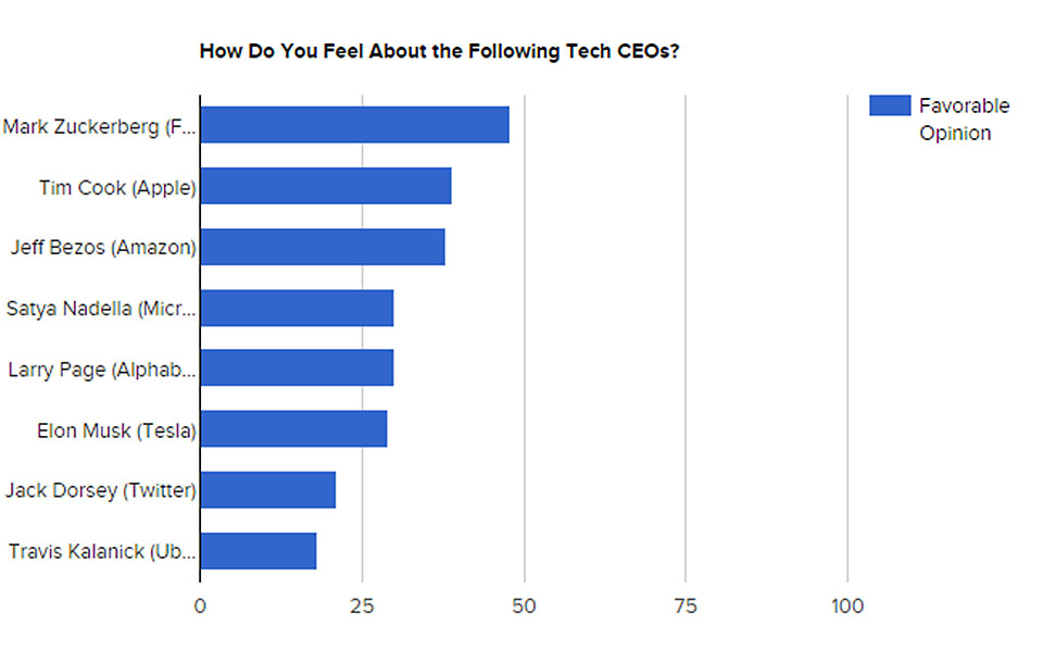
Despite this, he created a tech super giant: Facebook. 📱💬👍👎
Facebook was designed to be
“Clean and Simple 💎. No Disneyland 🏰, no live nude girls 💋”.
But, why does simple work?💎
Simple tells a clear story that your audience will immediately understand.
A user can only 👏 agree with you 👏 if they first understand you.
Simplicity will let you get your message across quickly, easily and convince your user of your point.
A person can hold four chunks of visual information in their short-term memory. If we don’t keep things simple, our audience will forget our point and we can forget about convincing them. 🧠🤔🤯🤷♂️💭
So remember: keep it simple, keep your audience. 👌💎🔑
Stealing the spotlight: Emphasise what matters
I’ve said it before and I’ll say it again. You don’t have long with your user.
What should you do about this?
Get your key selling points across quickly and effectively!
- 💡 Put selling points in the spotlight ->
- 🕰️ In turn, your audience will listen for longer ->
- 💸 The longer they listen the more chance you have to sell.
To illustrate this -> Moneyball. ⚾💰📊
Notice here how 🎬 Brad Pitt 🎬 gets his point across to his sceptical audience.
“Why? He gets on base” 🏟️🥇
As a data analyst, it is easier for me to relate more to Jonah Hill than Brad Pitt in this situation. The numbers guy, the dashboard design dude, the data modeler and the DAX do-er who lacks the panache when conducting a sales pitch.
If you fancy becoming the Jonah Hill of the story I’ve got your back:
Become a Data Analyst: 5 Stupidly Simple Steps
But to get to the point, how do you do this in your dashboards?
Use the Gestalt Principles of design.
These principles set rules for how to focus your users attention.
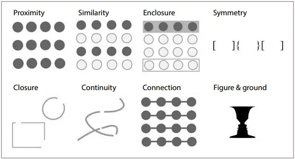
- 📍 Proximity: Three rows of dots are seen instead of four columns because they are closer horizontally than vertically.
- 🧩 Similarity: Objects that look similar are seen as part of the same group.
- 🔒 Enclosure: The first four and last four dots are grouped as two rows instead of eight dots.
- 💠 Symmetry: Three pairs of symmetrical brackets are seen instead of six individual brackets.
- 📦 Closure: The square and circle are automatically closed instead of seen as three separate paths.
- 🌊 Continuity: One continuous path is seen instead of three arbitrary ones.
- 🌍 Connection: Connected dots are grouped as belonging to the same group.
- 🍁 Figure & ground: Two faces or a vase can be seen, whichever is seen becomes the figure, and the other becomes the ground.
Empowering Heros: Interactive Features
I’m going to cheat: Stretching from movies 🎥 -> videogames 🎮🦸♀️🤖👽
Have you ever played a video game before?
How about Mario?🍄👾🐢🏰
Playing is fun. It keeps the user engaged!
Without it being interactive, Mario would just be an image…..
Ever think pictures of an Italian plumber would make it as big as Mario?
If you do, you may need more help than I can offer in this article.

Mario lets the player “be the hero”.
It is going to be hard to accept but creating dashboards can sometimes mean allowing the 👨🔬 user to be the hero 💪. Allow them to uncover the hidden gems of the data by interacting with your visuals and slicers.
Be the enabler to their investigation.
I mean lets face it, how awesome is it to uncover an easter egg in a game 🥚🎮
(or in real life but this has more applications to my stomach than dashboards).🍫
Cut! Closing Thoughts on Dashboard Design
In conclusion, effective dashboard design is about more than just presenting data. It’s about crafting a compelling story that speaks to your audience’s needs and interests – sell me this pen!
By taking cues from the world of cinema, you can bring your dashboard design to life and engage your audience in a way that traditional data presentation simply cannot.
🧠Remember to🧠
🎯 focus on your audience,
💥 tell a story that they care about,
👌 and keep it simple.
By mastering these techniques, you can create dashboards that not only inform but also persuade and captivate your audience. So, grab your popcorn and get ready to be the hero of your data story! 🦸♂️🦸♀️🌟
Final Tip for Cinematic Dashboard Design
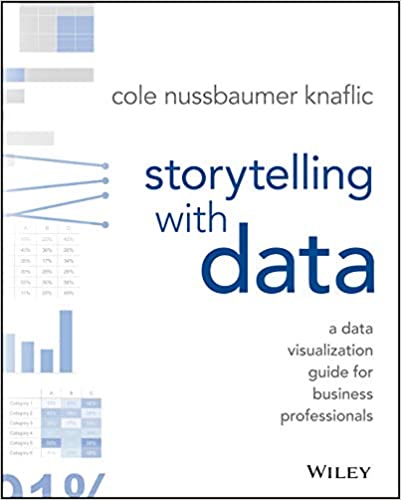
I cannot recommend “Storytelling with data” enough. It has single-handedly changed my dashboard design process within the 3 days it took to read.
Please…….please…….please…….read this book. Your career will thank you for it!